CeliaRipple.github.io
Distance from point model:
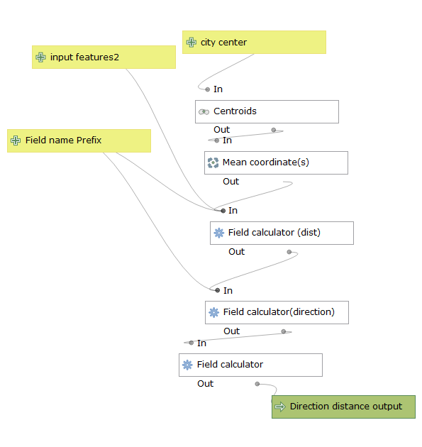
this model allows the user to find the directions and the distances of polygons on a shape file from a point either on a separate layer or a point created via the centroid function. This model is a sensitive to the project of the input shapefiles User should choose projections or reproject into projections that work for calculating distance such as state plane or UTM projections.
The user should consider their polygon shapefile to be featureinput2 in this model. City center should be a coordinate point
on a separate layer, or can be created by selecting polygon(s) on the shapefile. The Model will find the centroids of the
selected polygons then average their centers to create one coordinate point.
Then the model will find the centroids of all the polygons in the featureinput2 layer and calculate their distances and direction from the citycenter layer.
An added feature allows the user to create original names for output fields.
I ran the model through a case study using Milwaukee county census tracts and CBD. I obtained my data from I ran the model through a case
study using Milwaukee county census tracts and CBD. I obtained census tract boundaries from the census’s website:
https://www.census.gov/geographies/mapping-files/time-series/geo/carto-boundary-file.html
and I obtained the tract information from American Fact Finder: https://factfinder.census.gov/faces/nav/jsf/pages/index.xhtml
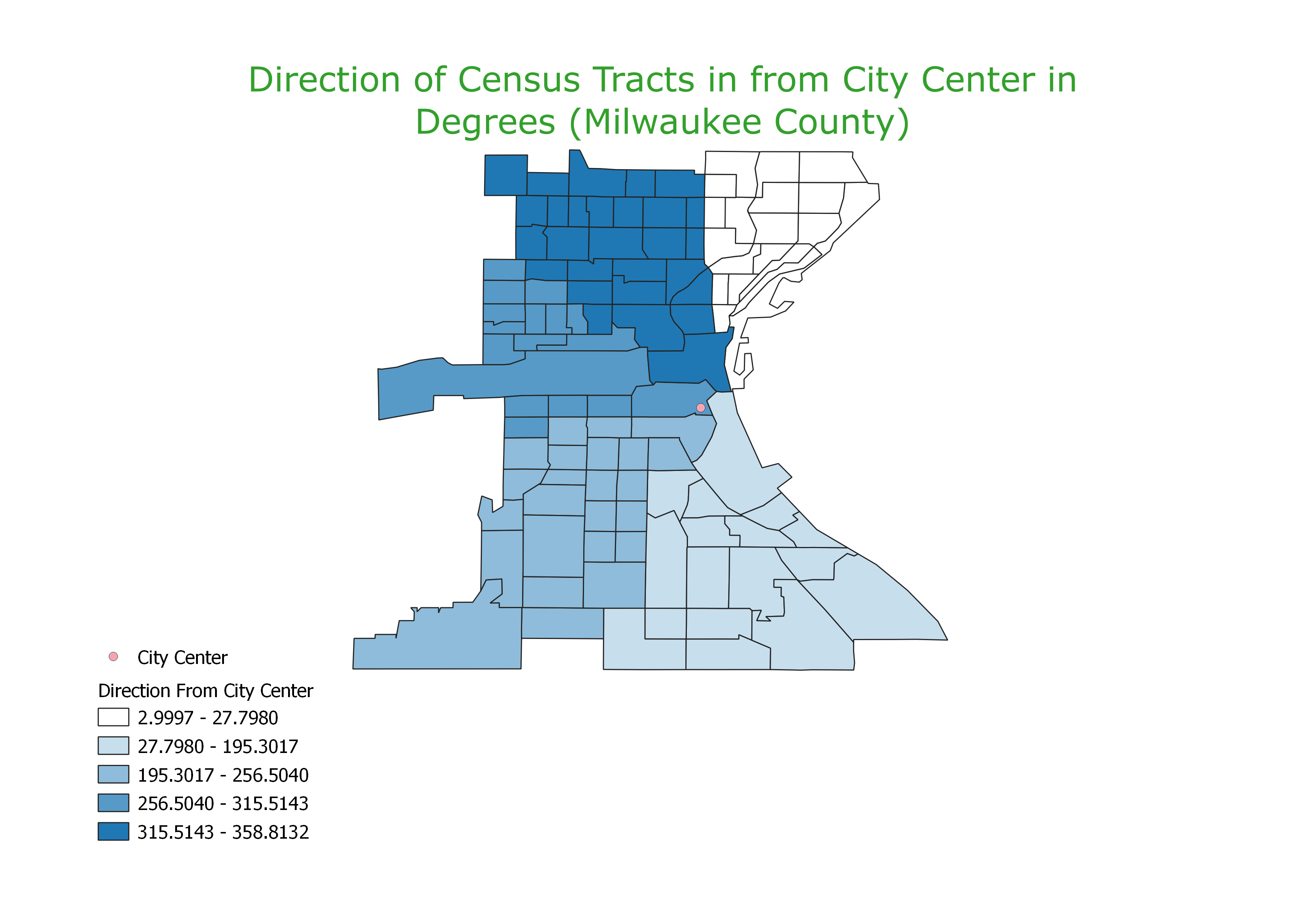
This is a visulization of the direction of census tracts from the CBD in Milwaukee MapDirectionFromCityCenter
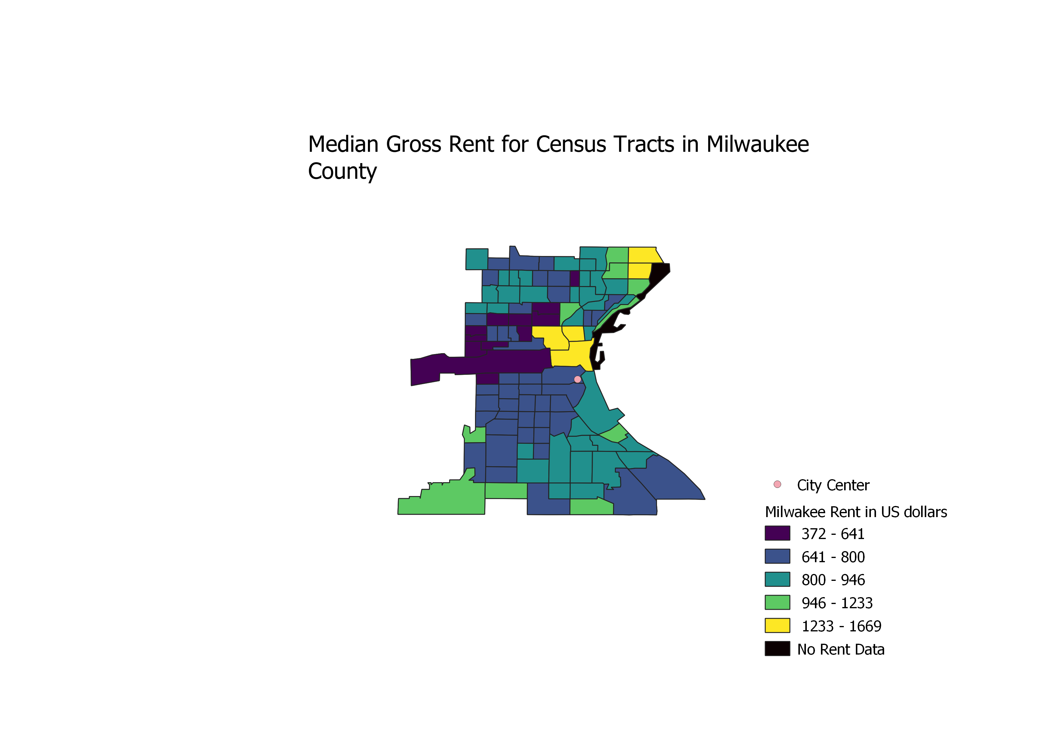
Visulization of rent for census tracts in Milwaukee county Rent
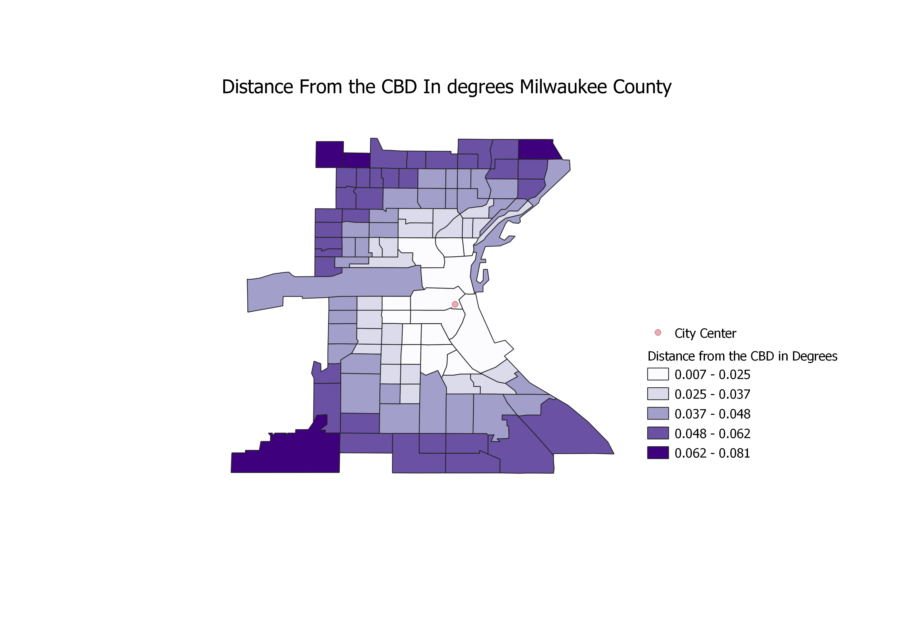
visulization of the distance from the CBD by census tract Distance
scatter plot where Median Gross Rent is graphed in relation to distance from the city center: scatterplot polar plot where Median Gross rent is graphed in relation to direction:polarplot Here you will find a link to to the model: lab1model
discussion of results: The model allows us to analyze the cost of rent by census tract in relation to the location of the Central Business District. The scatter plot showing the cost of rent in relation to distance shows 3 spikes in rent in relation to the CBD the first in ver close to the CBD indicating that rent is really high in the city center. There is another spike between 150 and 200 meters from the CBD then again at the census tracts that are farthest away from the city. The map of the rent also reflect that. The polar plot that shows the rent in relation to direction shows that the highest rents are to the north of the CBD. There is very little variance to the west of the CBD. It is interesting that the most wealthy and the poorest census districts are adjacent on the rent map.