CeliaRipple.github.io
Twitter Lab
Introduction:
Twitter, like other forms of social media, is a source of big data on the everyday experiences of people. With the rise of
twitter communications geograhpers are exploring whether twitter data can be used to track major events like natural disasters and political events. In this lab, we used twitter data on Hurricane Dorian from September 11th 2019 to explore whether the real storm or the storm of fake news from President Trump about the path of the storm generated more tweet content. The goal of this lab was to make a heat map (kernal density) in QGIS that showed areas with a high rate of tweets about Hurricane Dorian, and two maps- one that showed the hot spots and cold spots of Dorian tweets and another that identified the counties where the difference was statistically significant based one p values 0.05, 0.01, 0.001.
Data
For this lab we used two collections of tweets: One related to Hurricane Dorian defined by keywords: fill in Another for the baseline tweets for November that we will use to normalize the Dorian tweets by location. We downloaded this data via Twitter API using a developer acount. The maximum number of tweets returned for one token is 18,000 tweets. We also used the projected coordinate system: SA Contiguous Lambert Conformal Conic projection from https://www.spatialreference.org The SRS is 102004 . There is a PostGIS insert statement to add the coordinate system to a database. And we used county level geographic and population data from the US census. The R code we used for this is included in the the next link For this lab we used Rstudio, PostGIS, GeoDa, and QGIS
Process
The tweets collected for this lab were based on keywords searches with R code that is outlined in the code above. The keywords we used to identify hurricane tweets were: “dorian,” “hurricane” and “sharpiegate.” Then we uploaded the two collections of tweets into a PostGIS database using te “UPLOAD RESULTS TO POSTGIS DATABASE” section from the R code above. We also used the “SPATIAL ANALYSIS” section to download the county level geographic data using the Census API. Once everything was downloaded into the PostGIS database we used the SQl code here: Full SQL code to run though the next set of steps:
First, the tweet data needs to be given point geometry so that we can do a spatial join later on with the tweets and the counties layer. They also need to be projected into a coordinate reference system: SA Contiguous Lambert Conformal Conic which had the SRS 102004
select addgeometrycolumn('november' ,  'geom' , 102004, 'point',2);
update november
set geom = st_transform(st_setsrid(st_makepoint(lng,lat), 4326),  102004)

select addgeometrycolumn('dorian' ,  'geom' , 102004, 'point',2);
update dorian
set geom = st_transform(st_setsrid(st_makepoint(lng,lat), 4326),  102004)
Transform the counties layer into Contiguous Lambert Conformal Conic and add geometry
update counties
set geometry = st_transform(geometry,102004);
select addgeometrycolumn('counties' ,  'geom' , 102004, 'point',2);
select
populate_geometry_columns('public.counties'::regclass)
next delete all of the counties that we don’t need from the counties layer. The Hurricane was concentrated to the east coast so we don’t need to anyalyze tweet data from farther west of middle America. The STATEFP is the code for the state and all counties in the same state have the same state code so all counties with these state codes will be deleted.
delete from counties
where "STATEFP"
not in('54', '51', '50', '47', '45', '44', '42', '39', '37', '36', '34', '33', '29', '28', '25', '24', '23', '22', '21', '18', '17', '13', '12', '11', '10', '09', '05', '01')
Next add both the dorian tweets and the november tweets to the counties layer via a spatial intersect. This step allows us to give identical geoids to all the tweets that fall into the same county so that we can sum them by county in the next step.
alter table november add column geoid varchar(5);
update november
set geoid = _geoid
from counties
where st_intersects(counties.geometry, november.geom)

alter table dorian add column geoid varchar(5);
update dorian
set geoid = _geoid
from counties
where st_intersects(counties.geometry, dorian.geom)
Next count the tweets by identical geoids
select count(geoid) as tweetcount, geoid
from november
group by geoid
create view tweetspercounty

create table doriancounts as
select geoid, count(dorian.geoid) as count
from dorian
group by dorian.geoid
Add columns to the counties layer where the counts of tweet per county will be stored.
alter table counties
add column tweetscount integer

alter table counties
add column tweetscountdorian integer
In order to add values to these columns they have to first be set to 0
update counties
set tweetscountdorian = 0

update counties
set tweetscount = 0
add the count information to the counties layer
update counties
set tweetscount = tweetcount
from tweetspercounty
where counties._geoid = tweetspercounty.geoid

update counties
set tweetscountdorian = count
from doriancounts
where counties._geoid = doriancounts.geoid
the next step is to calculate the dorian tweets normalized by the population. We do this so that all areas will be weighted equally regardless of the population. Without this step the areas with higher population would like like hotspots of tweets about the hurriane just because more people are tweeting generally in these areas. First add a column for the tweet rate. Then update it with the equation to normalize the data
alter table counties add column doriantweetrate float;
update counties
set doriantweetrate = ((1*1.0000)*( tweetscountdorian/"POP"))*10000
The last step is to normalize the dorian tweets against the baseline numbers of tweets in November. Add a column for the ndti and use the expression to normalize the tweet data. With this expression the counties will either be either -1, 0, or 1.
alter table counties add column ndti real;
update counties
set ndti = (tweetscountdorian - tweetscount)/ (tweetscountdorian + tweetscount)
Where tweetscount > 0 or tweetscountdorian > 0
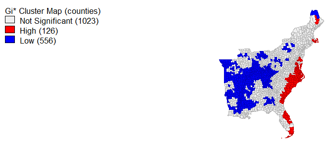
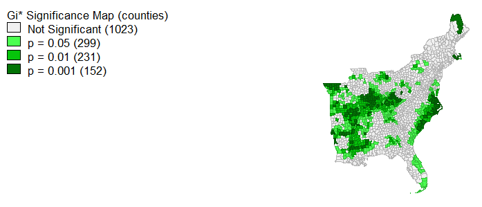
The step is to create some visulizations of the data. For this part of the lab, we used some functions in QGIS and GeoDa. First we connected to our databases in GeoDa. Then we used the Weights Manager tool under Tools and selected create a new weights matrix. Use the geoid as the unique id. Keep threshold distance at default and Create. From here we created a local G* cluster map which is located under Space. the variable is doriantweet rate. Create. The outputs are the the hotspot and the statisical significance maps shown above-
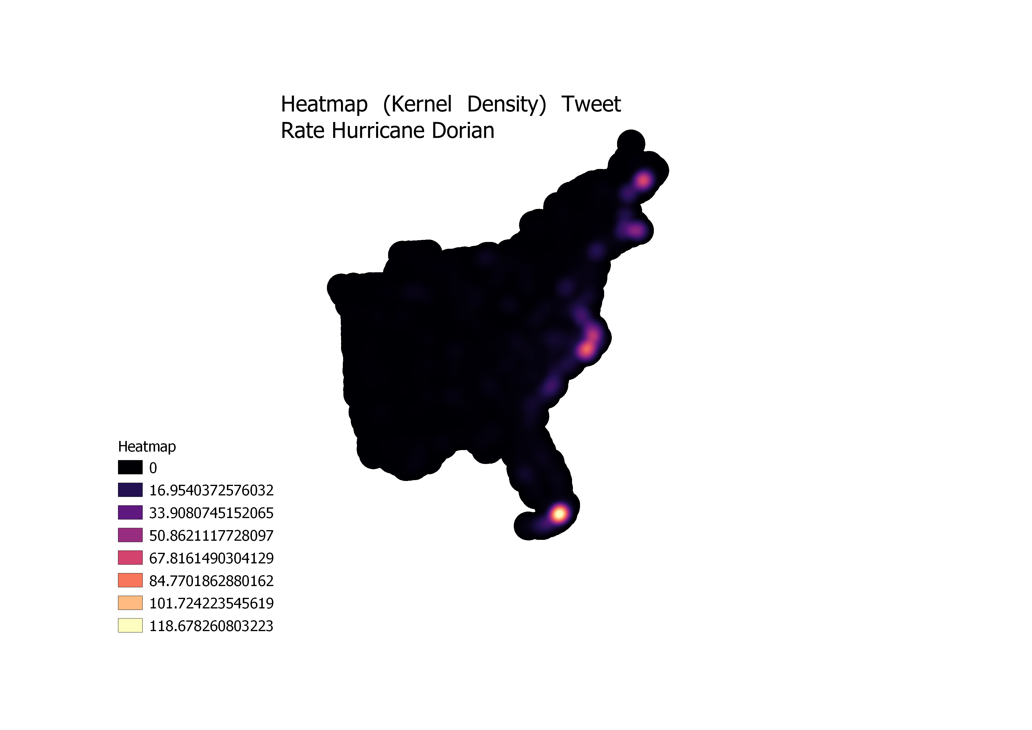
To create the Heatmap (Kernel Density) we first converted the counties into points by using the centroid function in QGIS. Then with this layer as the input we used the Heatmap (Kernel Density Estimation) Algorithm in QGIS. We set the radius to 100 km and the set the Weight from field to the tweet rate column We set the pixels to 500 meters. This parameters were chosen so that the function would run at a reasonable speed, but also have good visulation.
Discussion:
Looking at the Statistical significance map and the hotspots map together we see that there are “hotspot” counties shown in red in North Carolina and Florida, however results are significant only to 0.05 in Florida but 0.001 for a number of counties in North Carolina. This incates that the eastern region of North Carolina was in fact a hotspot.
The heatmap also shows bright areas in Flordia and North Carolina. The heat map shows not just where high numbers of tweets are located, but where they are specifically clustered.
error: using tweets to study natural disaster events is becoming more common in geographic studies, however it is important to note that only 1% of tweets have geocoordinates. The spatial specificity of tweets also can vary a lot depending on whether the tweet is located based on geocoordinates, user profile, or bounding boxes.
Conclusion: From this lab we were able to determine that the spikes in tweets about the hurricane follow the actual path of the hurricane and not the path that the Trump drew with a sharpie.